Color Palette of the Month: August 2025
August holds that in-between feeling — summer light still lingers, but the air begins to soften, hinting at the season to come. This month’s palettes capture that transition: muted warmth, gentle dusk tones, and earthy grounding shades that carry both brightness and calm.
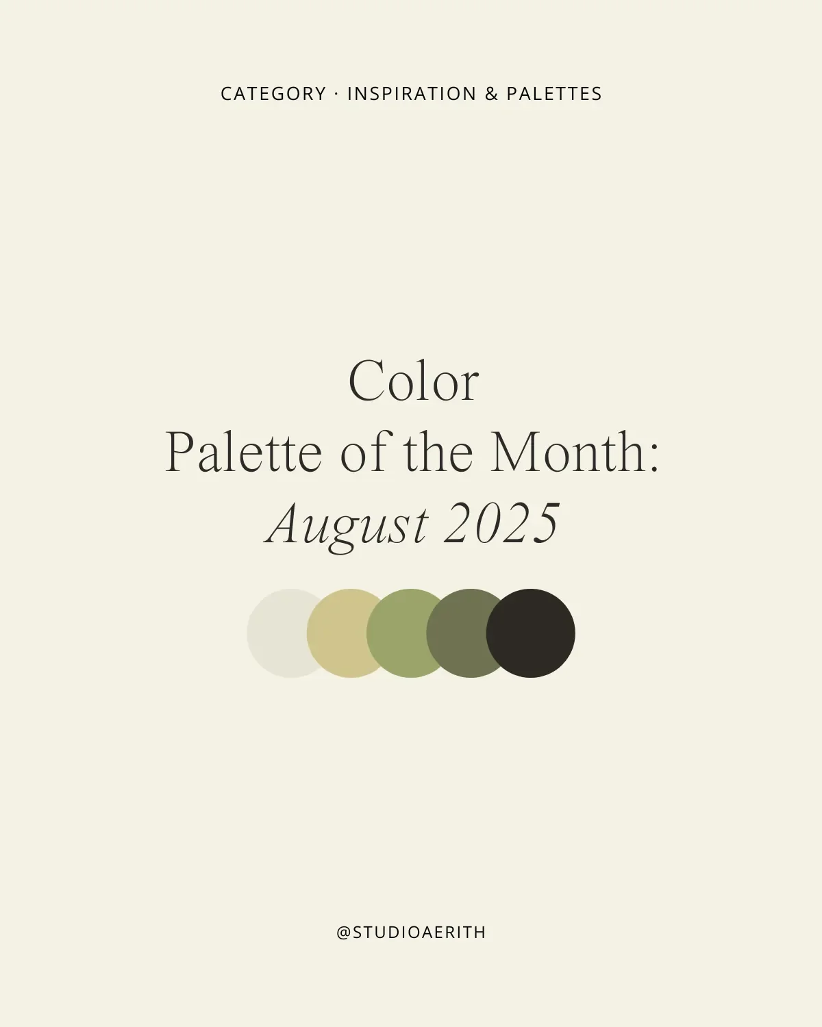
Each palette includes five coordinating hues with HEX codes so you can bring them directly into your design work — for journals, branding, social graphics, or wherever your creativity flows.
How to Use These Palettes
Choose one anchor color for your headlines or focal elements.
Balance it with one or two supporting hues in backgrounds or blocks.
Add a contrast or accent color sparingly for links, icons, or emphasis.
Keep the deepest shade for text, ensuring clarity and legibility.
This Month’s Palettes:
Thyme & Rye
August Linen
Sage & Slate
Blush & Espresso
#F7E9E6
#E8CFC6
#C58E7B
#603F2F
#1F1A17
Copied!
Coastal Clay
Bringing the Palette Into Your Work
Sun-Dried Clay offers warmth with a grounded, earthy undertone — perfect for cozy or organic designs.
Golden Prairie holds brightness with muted golds, suggesting late summer fields.
Stone & Lavender brings a touch of softness and quiet elegance.
Amber Dusk feels rich and moody, perfect for depth and contrast.
Misty Horizon is calm and expansive, ideal for minimalist or contemplative layouts.
Which of these August palettes feels most aligned with your creativity right now? Share your favorite — or tag @studioaerith if you bring it into your work. I’d love to see how it comes alive in your projects.