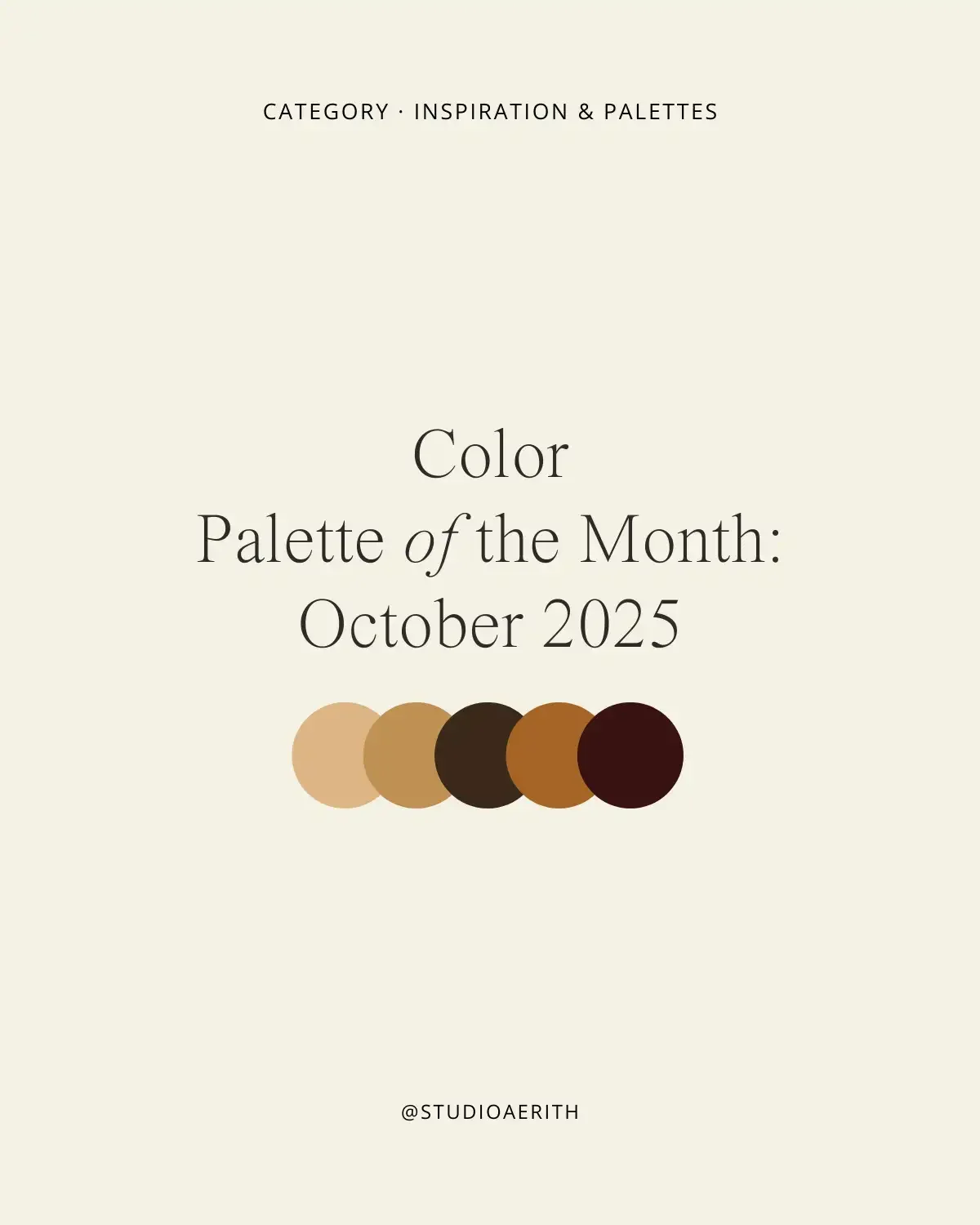
Color Palette of the Month: October 2025
Five Autumn Palettes to Inspire Warm, Grounded Creativity
October always carries a shift in rhythm. The light softens, the air cools, and the world seems to move a little slower. It’s the month of transition — from the vibrancy of late summer into the deeper, richer tones of autumn. For creatives, it’s a season of grounding. We trade bright hues for muted warmth, and in that shift, we find a palette of calm.
This month, I’ve curated five autumn-inspired palettes that capture the spirit of October: earthy neutrals, golden spice, olive greens, and deep, moody browns. These colors are designed to bring ease and inspiration into your journaling, branding, or seasonal design projects.
Muted tones are more than an aesthetic choice — they’re a creative tool. Bright colors excite, but muted palettes soothe. They help reduce visual overwhelm, allowing your work (and your thoughts) to breathe. When you bring these palettes into your creative practice, you’re not just choosing colors — you’re inviting balance, rhythm, and calm.
1. Autumn Leaves
A palette of deep brown, caramel, and pumpkin spice. Warm, bold, and inviting, these tones echo fallen leaves scattered across a quiet path. Perfect for journaling spreads that need a spark of energy or branding that wants to capture the essence of October.
2. Tuscan Olive
Rooted in earthy greens and roasted coffee tones, this palette feels grounding and organic. It’s ideal for mood boards, nature-inspired projects, or any design that leans toward a rustic, slow-living aesthetic.
3. Harvest Table
Golden batter, toasted caramel, and spiced wine — colors that bring to mind bread baking, warm kitchens, and candlelight. This palette is about comfort and richness, making it beautiful for product packaging, cozy printables, or illustrations with a handmade feel.
4. Cornucopia
Bold ochres, warm clay, and deep chocolate browns create a palette of abundance. It celebrates autumn’s fullness while staying balanced and versatile, equally fitting for minimal design or bold seasonal graphics.
5. Dried Citrus
Amber-gold, burnt orange, and burgundy layered with rich browns. Inspired by the textures of dried fruits and seasonal spices, this palette carries nostalgia and depth, perfect for backgrounds, digital planners, or creative storytelling projects.
This Month’s Palettes:
Autumn Leaves
Tuscan Olive
Harvest Table
Cornucopia
Dried Citrus
Why Muted Tones Matter in Your Creative Process
Why muted tones matter in your creative process
Muted palettes aren’t just “pretty” — they shape how we experience design. Bright, bold colors grab attention, but they can also feel overwhelming. Muted tones, on the other hand, encourage slower interaction. They create space for ideas to breathe.
In journaling and reflection practices, muted colors support calm. In branding, they create timelessness. And in design work, they allow textures, words, and imagery to shine without distraction. That’s why I return to these palettes each season — they aren’t just about aesthetics, but about feeling.
Free Download: 5 Autumn-Inspired Backgrounds
To help you bring these palettes into your own creative rituals, I’ve created a Free background pack — 5 high-resolution, textured designs you can use in journals, planners, or seasonal mood boards.